

Painting HD Cameras - Skin Tones
/Painting HD Cameras - Skin Tones
© 2009 NegativeSpaces (revised January, 2014)
In my experience color correcting video cameras in the field, 9 times out of 10 I’m trying to resolve some sort of skin tone issue – taking green out, bringing overly magenta skin back within a normal range, or sometimes just injecting a little bit of warmth and saturation. Knowing how to correctly use a video camera’s User Matrix menu and Color Correction menu as well as the Tonal Control menu is the key to working through these inevitable problems. In building upon my previous article on in-camera color correction for HDTV, this next article will specifically address how to use the various matrix menu attributes to affect skin tones.
This article builds off what was established in Painting HD Cameras - Basic Colorimetry.
Technical Notes:
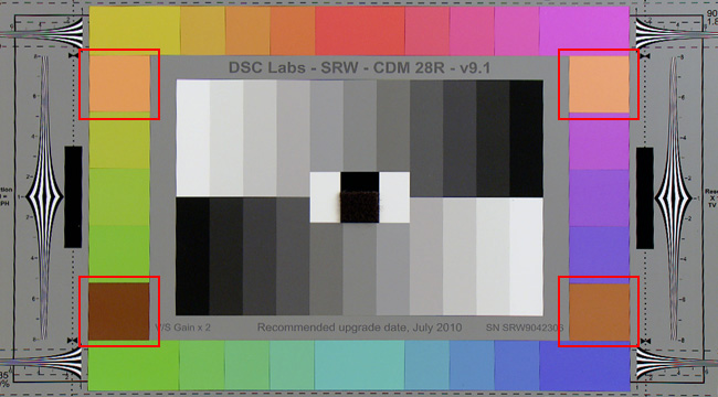
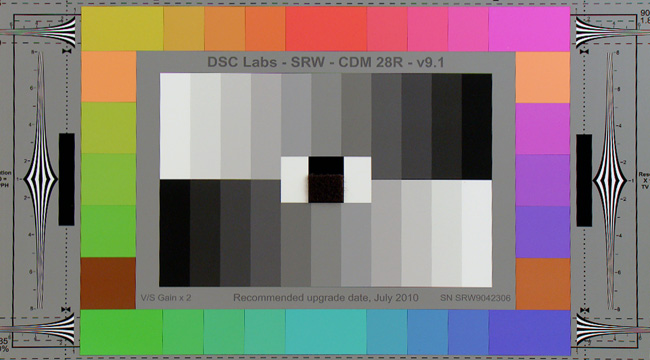
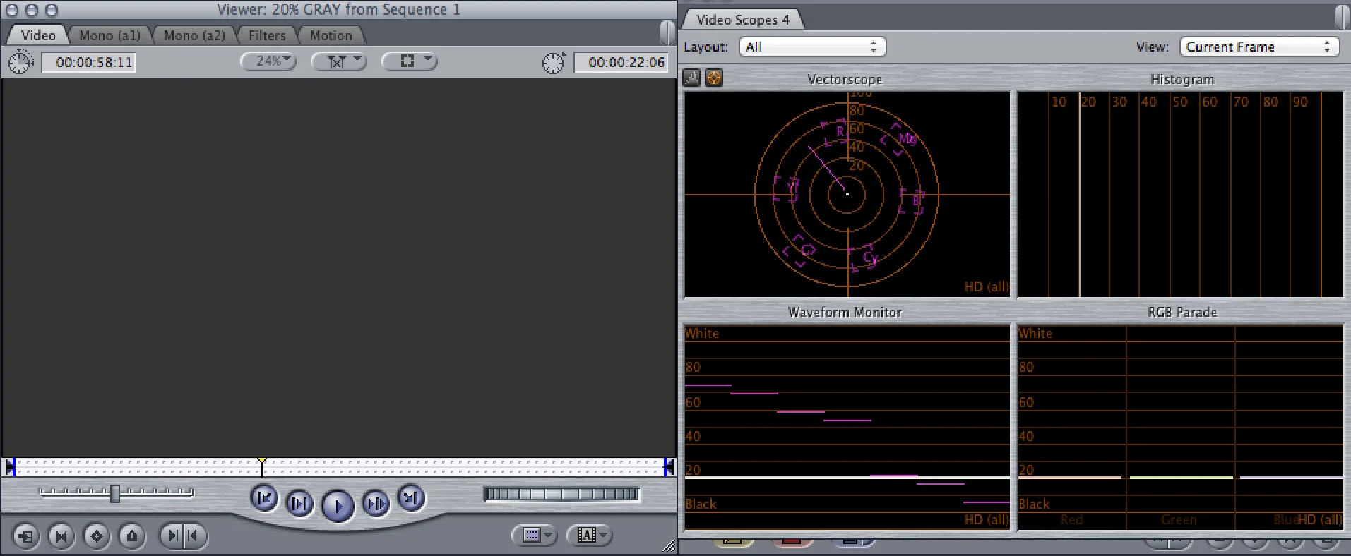
The images used in this article were created with a Panasonic HDX900 and the stills and vectorscope information were captured from a Leader LV 5330 Multi-SDI Monitor. Because a Panasonic camera was used, the workflow presented and menu features explained are those found on Panasonic cameras. The feature set on Sony cameras is similar enough though that I feel that if you know one system, you should be able to apply the same concepts to the other. The chip chart used was a DSC Labs CamBelles Chart. These charts are the standard for video engineering and camera alignment. Because the colors and values are so uniformly printed and tested, they can be measured electronically with repeatable results. Correct use of DSC Labs equipment can not only be used to calibrate and match equipment but to paint custom looks in the controlled environment of your studio.
On naming conventions:
In most Panasonic cameras, the Linear Matrix is referred to as User Matrix and the Multi Matrix is referred to as Color Correction. In Sony cameras, Linear Matrix is referred to as Matrix Linear and the Multi Matrix is referred to Matrix (Multi). As this is a Panasonic oriented article, from here on out I'll be using the Panasonic nomenclature.
Part 1: Overview
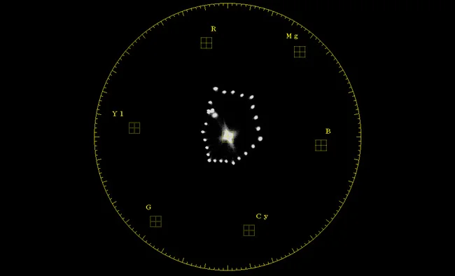
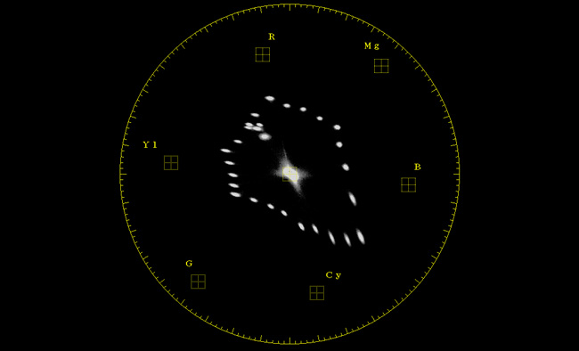
First to re-hash, there are six attributes that affect a video camera’s Linear Matrix: B-G, B-R, G-B, G-R, R-B, R-G. Those are read “Blue into Green, Blue into Red, etc.” Additionally, there are twelve Color Correction attributes we can modify: R, Mg, B, Cy, G, Yl, Yl-R, R-Mg, Mg-B, B-Cy, Cy-G, and G-Yl. For an in depth account of how these attributes work by pushing and pulling colors around the vectorscope, please refer to the previous tutorial. Using the handy DSC Labs Chroma Du Monde Chart with its 4 "generic skin tone" swatches, let's have a look at our camera's "out of the box", default colorimetry:

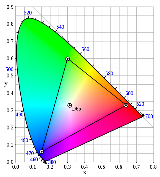
Interestingly enough, virtually all human skin regardless of its hue or saturation resides somewhere within or nearby this red circle which for simplicity we'll call the "Skin Tone Region". The area resides along the I line on the Vectorscope and above the Q Line (see the intersecting lines on the graphic below). Where the Q Line crosses the I Line, skin tone saturation is at zero. The closer the skin tone information is to the boundary of the circle, the greater its saturation. Smart camera software such as Skin Tone Detail Circuitry knows to look within the Skin Tone Region and is thus able to isolate the information there to make independent adjustments. This is very helpful because it becomes easier to predict how the values are going to move around on the vectorscope as adjustments are made to the camera.


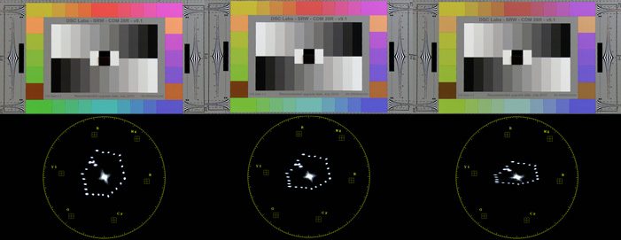
Now before we start playing, let's get a better idea of how these variables will affect actual human skin by using the DSC Labs CamBelles chart. Obviously sitting models would be better but for what it is, this chart is incredibly precise and I've used it to paint looks in the studio that have worked perfectly well in the field.
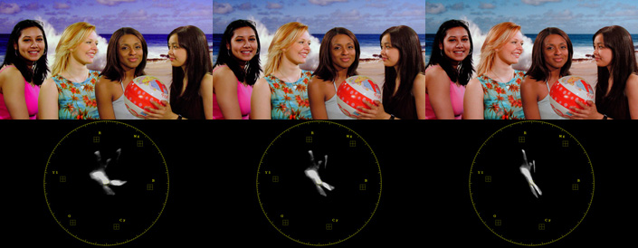
The lovely ladies of DSC:

There is a good variety of skin tones here and the light in the scene is modeled enough that you can examine a good range of values. Also the fact that they're wearing bright clothes and are on a blue background helps to isolate the skin tones on the vectorscope.
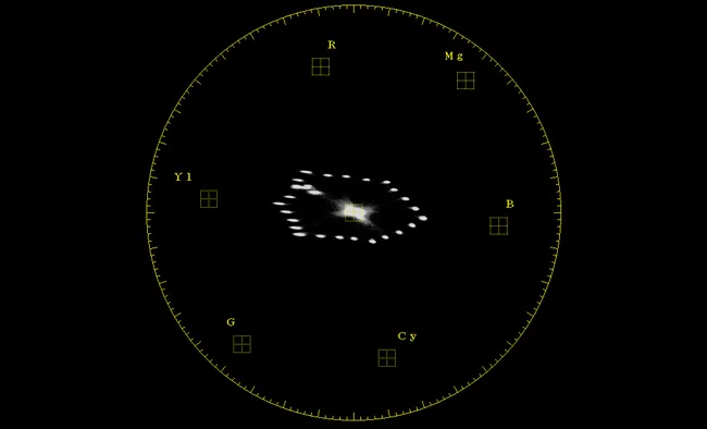
Here's what they look like on the Vectorscope:

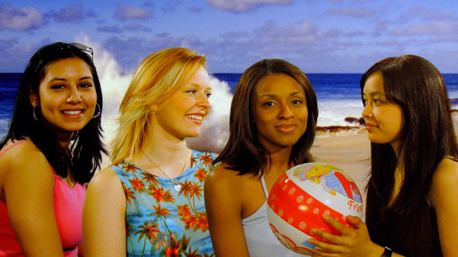
This isn't a tutorial on tonality but part of getting good colors means getting a good exposure. This is what my properly exposed and properly white balanced CamBelles look like on the waveform.

And if you have False Color on your monitor, you can use it to confirm your exposure:

Usually you want to keep it in the green-yellow zone for light skin tones and green-blue for dark. Orange is 80% which is where skin starts to break up so you definitely don't want your key light hitting that hard.
Skin tones can also be affected globally with Master Saturation Controls. Increased Saturation on the left and decreased Saturation on the right:

Part 2: User Matrix menu and skin tones
Typically you wouldn't use matrix adjustment to specifically affect skin tones as these are more global adjustments but it's good to see what the effect is. You're also hardly ever going to only use one of these adjustments. When creating a custom look, you'll most likely be pushing values around in all six menu options.
For example, let’s look at a side by side of the Cambelles when you put the G-B (Green into Blue) attribute at its maximum value, +63 on the left and its minimum value, -63 on the right:

As you can see, you’re never only affecting the skin tones. In your quest to render the perfect skin you’re also affecting plenty of other colors. It’s very easy to get caught in an endless cycle of color correction where you fix one thing only to create a new problem with another color. Only through trial and error and understanding the basic principles behind how in-camera color correction works will you be able to quickly execute the best solution.
Now let's have a look at both what happens to our skin tones when we adjust each of the user matrix variables:
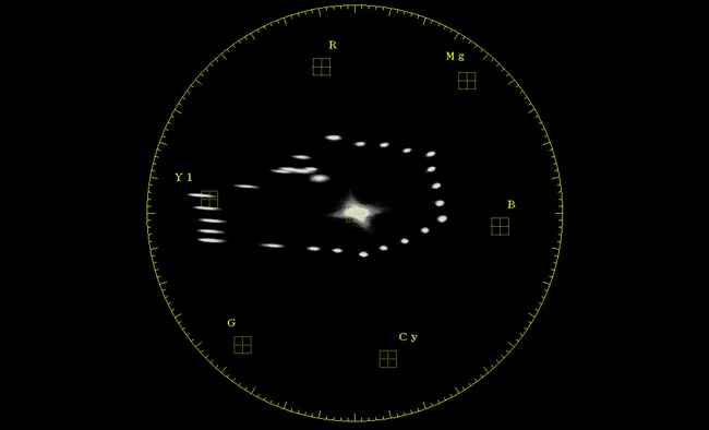
B-G, BLUE INTO GREEN:
On the left - Positive Value, In the middle - Default Value, On the right - Negative Value

B-G +63 (increase in value)

B-G –63 (decrease in value)

B-R, BLUE INTO RED:
On the left - Positive Value, In the middle - Default Value, On the right - Negative Value

B-R +63 (increase in value)

B-R–63 (decrease in value)

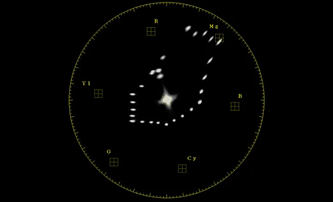
G-B, GREEN INTO BLUE:
On the left - Positive Value, In the middle - Default Value, On the right - Negative Value

G-B +63 (increase in value)

G-B –63 (decrease in value)

G-R, GREEN INTO RED:
On the left - Positive Value, In the middle - Default Value, On the right - Negative Value
G-R +63 (increase in value)

G-R –63 (decrease in value)

R-B, RED INTO BLUE:
On the left - Positive Value, In the middle - Default Value, On the right - Negative Value

R-B +63 (increase in value)
R-B –63 (decrease in value)

R-G, RED INTO GREEN:
On the left - Positive Value, In the middle - Default Value, On the right - Negative Value

R-G +63 (increase in value)

R-G –63 (decrease in value)

Part 3: Color Correction menu and skin tones
Unfortunately I don't have CamBelles examples for working with the Color Correction menus. The attributes you'll be working with the most in regards to skin tones are the following three video colors: Red-Yellow (Yl-R), Red (R), and Yellow (Yl).
In the Color Correction menu set, we can isolate and modify the following twelve individual vectors: six primary video colors - Red (R), Yellow (Yl), Green (G), Cyan (Cy), Blue (B), and Magenta (Mg) and the six colors in between the primaries - Red-Magenta (R-Mg), Magenta-Blue (Mg-B), Blue-Cyan (B-Cy), Cyan-Green (Cy-G), Green-Yellow (G-Yl), and Yellow-Red (Yl-R).

As exemplified in the above graphic, the colors in and around these areas will be affected by their corresponding adjustments. To modify the Hue or Saturation of Red, use the "R" Color Correction attribute, for the colors in-between Yellow and Red, use "Yl-R", etc.

These Color Correction attributes are modified with a Phase and Saturation control. A negative Phase value (-) will move the color to the left on the vectorscope, a positive Phase value (+) will move it to the right. A negative (-) Saturation value will move the color closer to the center of the vectorscope, decreasing saturation and a positive (+) value will move it closer to the edge of the circle, increasing saturation. By altering the Phase on an individual color you are moving it out of alignment with other colors and reducing the amount of shades the camera can reproduce. Using these controls you can work on individual colors (such as skin tones) and subtly alter their hue and saturation but you still will affect any other color that contains the color you are modifying. The effect is far more subtle than the Linear Matrix adjustments, however is often necessary to arrive at a very specific hue or color saturation. Color correction in post production allows for a much finer degree of control so in some cases, it's best left to them.

As mentioned in the previous article, you're very rarely only going to work with one attribute at a time. It's really understanding how they're all used together that's the key to good camera painting. Every task is different and there is no "one size fits all" approach. However I will Yl-R in Color Correction is often where I start when trying to inject some warmth and life into dull looking skin. Please support this blog by leaving comments and feedback. It's really only through user support and feedback that content can be fine tuned so I always appreciate hearing from you.


 © 2021 Bennett Cain / All Rights Reserved /