Canon Picture Styles and Chroma Du Monde
/Canon Picture Styles and Chroma Du Monde
I was curious about the real differences on the video level between the various Canon HDSLR Picture Styles so I set up the DSC Labs RED CamBook Chroma Du Monde 28R and evenly lit it with ambient daylight.
Converting the camera's HDMI OUT to SDI, I set the exposure in the recommended way for the chart, putting the grayscale's crossing point at just under 60% on the waveform. I then made no exposure changes and just dialed through the various Canon Picture Styles capturing the waveform and vectorscope data from the Leader monitor.
Camera and Lens: Canon 5D Mark 2, Canon 24-105mm f/4 Zoom
All styles were adjusted to the following "standard practice" specs:
Contrast: all the way down
Sharpness: all the way down
Saturation: down 2 points
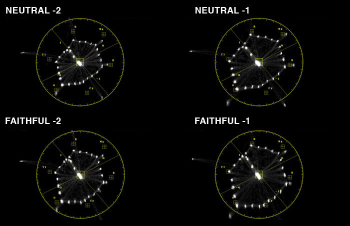
For Neutral and Faithful, the two "out of the box" Picture Styles that I find to be well suited for video, I looked at Saturation -1 as well to see how much difference 1 point makes on the scopes. The answer is a lot. Most people would agree that the colors on these cameras are over saturated and need to be backed off a bit to look more natural and less video. When adjusting a video camera's colorimetry using DSC charts, the theoretical goal is to ensure faithful color reproduction by aligning the primary colors into their targets. The color response that this creates however may not be suitable for all projects it may even look a bit over saturated compared to the low sat "film like" color matrices found in many prosumer camcorders.
Have a look:
Let's have a closer look at Faithful, Saturation -1
This is about as close as we can get to hitting our targets with the Canon 5D Mark 2. In my opinion this setting doesn't look as nice as Saturation -2 so as always, your eye is really your best tool for image evaluation.
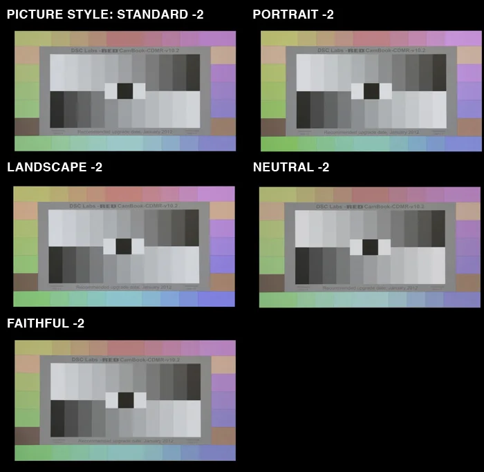
Canon Picture Styles: Looking at these thumbnails alone, it's a little hard to tell the difference.
Waveforms: Glancing at these however you can see that there is a small difference in gamma response from Style to Style, Neutral being the most compressed in comparison.
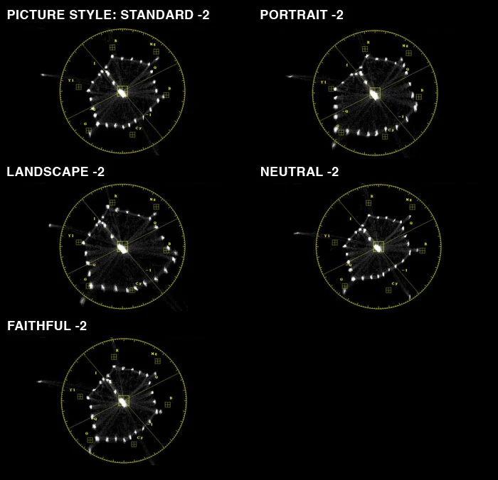
Vectorscope: Even with the saturation turned down, Portrait and Landscape are very extreme color looks compared to the more muted tones of Neutral and Standard. Faithful on the other hand, does what it say it does and offers the most accurately aligned video colors of the bunch.
In order to really see the differences though, you need to look at the chart in the context of video. Here's a file for you, feel free to download it and take into FCP where you can open up the scopes and really scrutinize the differences between Picture Styles.
Note: RED CamBook has a highly reflective surface so must be angled back to avoid seeing yourself in it which is why the image is skewed in this video. . There is a small amount of gamma lift that happens in Vimeo upon conversion to their format. Why does it do that? I don't know and I'm still searching for a workaround.
Canon 5D Mark 2 Picture Styles and Chroma Du Monde from Ben Cain / Negative Spaces on Vimeo.
As for the Canon 7D and 1D Mark IV? From what I discovered from the tests Jem and I did at Sekonic, the color response from the various Picture Styles is very similar to the results found here.


 © 2021 Bennett Cain / All Rights Reserved /