

Painting HD Cameras - Basic Colorimetry
/Painting HD Cameras - Basic Colorimetry
© 2009 NegativeSpaces (revised January, 2014)
Technical Notes:
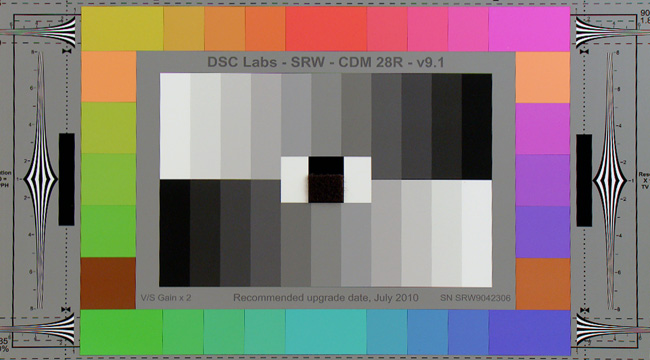
The images used in this article were created with a Panasonic HDX900 and the stills / vectorscope information was captured with a Leader LV 5330 Multi-SDI Monitor. Because a Panasonic camera was used, the workflow presented and menu features explained are those found on Panasonic cameras. The menu set on Sony cameras is similar enough though that I feel that if you know one system, you should be able to apply the same concepts to the other. The chip chart used was a DSC Labs Chroma Du Monde 28R CamAlign Chart. These charts are the standard for video engineering and camera alignment. Because the colors and values are so uniformly printed and tested, they can be measured electronically with repeatable results. Correct use of DSC Labs equipment can not only be used to calibrate and match equipment but to paint custom looks in the controlled environment of a studio. The GAIN on the Vectorscope images was set to x1. When doing critical camera matching or alignment with the Chroma Du Monde, it is recommended that you set your Vectorscope Gain to x2. For the purposes of this tutorial, I felt that keeping the Gain at it's default value of x1 best illustrated how to read the scope in the field and objectively evaluate color saturation.
Part 1: Overview
In this article we are going to use the video camera's Linear Matrix (also known as Matrix Table or User Matrix) and Multi Matrix (also known as Color Correction) menus to modify its colorimetry, which is the way the camera renders specific colors within its video color space which for HDTV is ITU-Rec. 709.
ITU-Rec.709 Video Color Space (from Wikipedia):
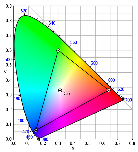
Please refer to the Wikipedia article for a detailed account of the above graphic.
On naming conventions:
In most Panasonic cameras, the Linear Matrix is referred to as User Matrix and the Multi Matrix is referred to as Color Correction. In Sony cameras, Linear Matrix is referred to as Matrix Linear and the Multi Matrix is referred to Matrix (Multi). As this is a Panasonic oriented article, from here on out I'll be using the Panasonic nomenclature.
The combined use of both the Chroma toolset (explained here), the Tonal Response Controls, i.e., Gamma, Knee, Pedestal, and Detail Circuitry is necessary to really "paint" a HD camera. There are a ton of tools at your disposal in a video camera's Paint menu and only through lots of trial and error and the use of a calibrated reference grade monitor can one learn to use them correctly.
In order for any of this to make sense one needs to know the nomenclature. Colors are referred to as Hues in engineering lingo and Phase refers to the relative position of the color as plotted by a line on the vectorscope. For simplicity, in this tutorial I'll be referring to colors as "colors" and not "hues". For describing a video camera's colorimetry, Japanese engineers have come up with a way of describing the six specific color phase adjustments we can make and those are G-B, G-R, B-G, B-R, R-G, and R-B.
“B-R” is read as: Blue ADDED TO Red which affects all colors MOST NOTICEABLY Blue, LEAST NOTICEABLY Red. A positive value increases the Saturation of Blue added to Red. A negative value decreases the Saturation of Blue added to Red.
“G-R”, is Green into Red. “B-G”, is Blue into Green, etc. With B-R, you are adding or subtracting Blue into or from the Red channel. G-R, adds/subtracts Green to the Red Channel. You get the idea.
The two colors that form the pair, i.e., B-R, are linked and therefore these adjustments will always change these two colors and often a third or fourth color as well. Generally, all colors are affected slightly, some radically.
These adjustments can be used to make colors punchier or more exaggerated, more saturated or de-saturated, create unique looks, or match one camera to another.
There is a finer point though –
One might think at first that by adding Blue to the Red channel, Red is going to get Bluer when in fact it has the opposite effect – Adding Blue to Red pushes it closer to its neighbor, Yellow, which makes all Red colors in your image become more Orange because that's what you get when you add Red and Yellow. It's actually basic color theory.
The way changing the Linear Matrix works on HD video cameras is you affect a color by pushing or pulling it into an adjacent color space and all colors are linked to the one opposite them. That said, you can make Red's look more Magenta or more Yellow but you can't turn Red into Green. It just doesn't work like that.

In video colorimetry, each color has a relationship with both its neighbors and its compliment on the other side of the scope. Really not much different than a color wheel used to teach art foundations.
If the naming conventions seem complicated, fret not because fortunately this tool set is essentially the same on every HD video camera. They make the visible colors in their color gamut from six primary video colors: Red, Blue, Green, Cyan, Magenta, and Yellow. This differs from traditional color theory somewhat in that there are three primary colors and three secondaries which are made from them.

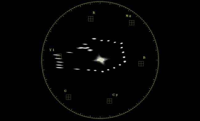
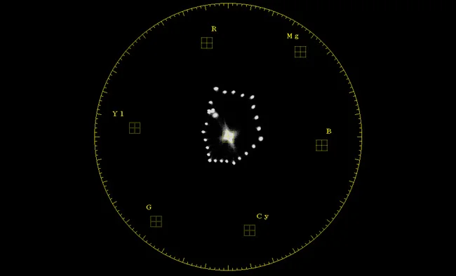
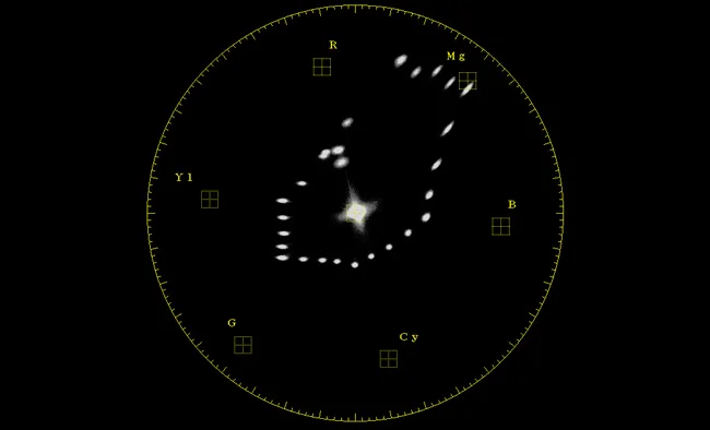
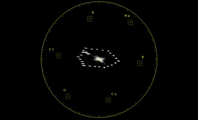
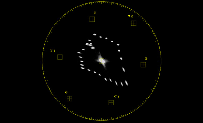
As you can see there are six colors represented. In the center of the scale is the “chroma free” zone. This area is neutral and colors close to it are very de-saturated and pastel. You can also tell if an image has been correctly white balanced when the concentration of this neutral picture information is centered on the scale. Colors increase in saturation as the move away from it towards the outer edge of the circle. Colors that leave the circle are “out of gamut” and aren’t broadcast legal. White Balance is an extremely important factor in digital imaging. For colors to appear "correct", meaning colors that look natural to your eye, your camera must be white balanced. White balance is a global control and moves your entire chroma information in between the red/yellow - blue/cyan axis. Creative use of white balance is an important tool at your disposal in artistic camera painting.
You can tell these images are properly white balanced because the neutral information is exactly in the center of the scope. On the left is an image with enhanced color saturation. The vectors are approaching the edge of the circle and the colors are extremely saturated, our Yellow has actually wandered "out of gamut" and is no longer broadcast legal. On the right is a very de-saturated image whose color information is close to the neutral center of the circle.

This is great because if you learn how to paint one camera you can basically paint any camera that has a User Matrix and Color Correction menu. That’s the nice thing about digital HD video – despite its many different flavors it’s all essentially the same.
All User Matrix menus have the same six adjustable attributes: B-G, B-R, R-B, R-G, G-R, G-B. You can use these menu adjustments to subtly or radically alter the color characteristics of your image. The User Matrix and Color Correction does NOT affect the camera's Tonal Response which is White, Gamma, or Black levels.
I've heard a video camera’s Linear Matrix likened to a film stock. I like this because just as film stocks have very specific responses to individual colors, so does a video camera’s colorimetry. That said you ordinarily wouldn’t change film stocks in the middle of a scene so a similar attitude toward the matrix is generally recommended. You can quickly end up with mismatched images if you start painting away like crazy so a good eye for continuity can’t be overstated. That isn’t to say you can’t do it but proceed with a light touch because matrix adjustments are baked into the video image and are often times irreversible.
As you’ll see in the examples below, there is no way to single out one individual color with the User Matrix adjustment tools. However, you can use the Color Correction menu toolset to more closely isolate and adjust individual colors within the Linear Matrix. You can't single out a specific color though as any other color that contains this color will also be affected. Always check the entire scene to gauge the effect.
In my experience, I use the User Matrix tools for the following:
-Camera matching or emulating the color response qualities of another imager such as a film stock or a CCD chipset from another manufacturer.
-Emulating a specific look such as Bleach Bypass, Day for Night, or some sort of Color Filter effect.
-Creating a base colorimetry or color response for a specific scene or project.
I use the Color Correction menu tools for:
- Adjusting the Phase and Saturation in the Yl-R Color Correction attribute is a great way to make fine adjustments to skin tone hue and saturation.
- Working on a specific color that needs modification. Often times with product shots, there is a very specific hue and saturation that must be followed.
- Fine and subtle color correction. As the name implies, the Color Correction menu can in fact be used this way however it can be an intense process and there is rarely the time on-set to spend on it so you're better off painting various looks in pre-production or at the checkout and modifying those as you go. Just be sure to keep everything within the limits of the legal gamut and don't throw colors completely out of phase and won't make things any worse.
In a nutshell, the User Matrix is more for broad strokes whereas Color Correction is for small. Ultimately though, you're always going to be using them together to arrive at the desired effect.
Part 2: Getting into the User Matrix menu
Within the “Paint” menu on the HDX900 you will find a menu called “Matrix”. Within it you will find the six attributes I mentioned that are adjustable in both positive and negative increments. On the HDX900 these increments max out at 63. On Sony cameras, I believe they max out at 99. At any rate, in practice it’s all the same. The comparison for each attribute is a value of 0 versus a maximum value of either +63 or -63.
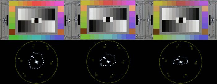
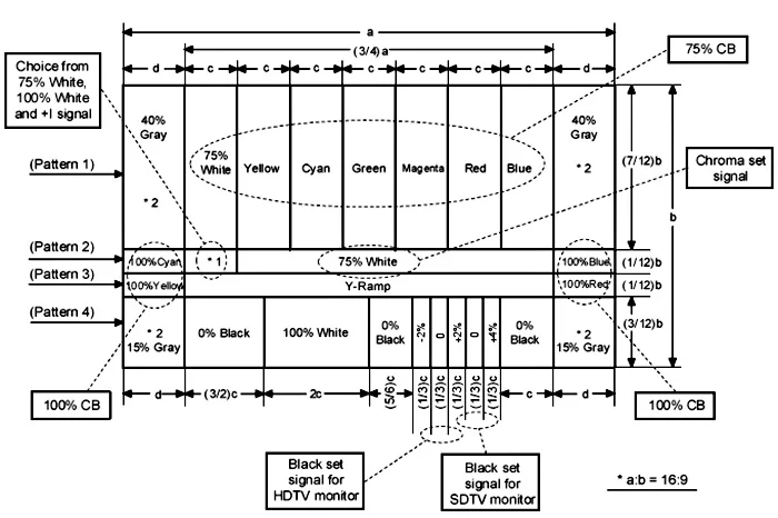
Here is a waveform of our basic, uncorrected Chroma Du Monde chart:

A correct exposure for the Chroma du Monde chart is indicated by exposing the 11 step grayscale so that is crosses at 60 IRE.
The importance of good exposure to camera painting can't be understated. Without good exposure, you don't have much to work with so start by ensuring your image is properly exposed.
USER MATRIX ADJUSTMENT EXAMPLES:
1. B-G, BLUE INTO GREEN:
On the left - Positive Value, In the middle - Default Value, On the right - Negative Value

B-G +63 (increase in value)

B-G –63 (decrease in value)

2. B-R, BLUE INTO RED:
On the left - Positive Value, In the middle - Default Value, On the right - Negative Value

B-R +63 (increase in value)


B-R–63 (decrease in value)


3. G-B, GREEN INTO BLUE:
On the left - Positive Value, In the middle - Default Value, On the right - Negative Value

G-B +63 (increase in value)


G-B –63 (decrease in value)


4. G-R, GREEN INTO RED:
On the left - Positive Value, In the middle - Default Value, On the right - Negative Value

G-R +63 (increase in value)

G-R –63 (decrease in value)

5. R-B, RED INTO BLUE:
On the left - Positive Value, In the middle - Default Value, On the right - Negative Value

R-B +63 (increase in value)

R-B –63 (decrease in value)


6. R-G, RED INTO GREEN:
On the left - Positive Value, In the middle - Default Value, On the right - Negative Value
R-G +63 (increase in value)

R-G –63 (decrease in value)


Part 3: Getting into the Color Correction menu
All Color Correction menus allow the same six components of the Linear Matrix plus six additional in-between components to be individually adjusted. They are: 6 primary video colors - Red (R), Yellow (Yl), Green (G), Cyan (Cy), Blue (B), and Magenta (Mg) and the 6 colors in between the primaries - Red-Magenta (R-Mg), Magenta-Blue (Mg-B), Blue-Cyan (B-Cy), Cyan-Green (Cy-G), Green-Yellow (G-Yl), and Yellow-Red (Yl-R)

As exemplified in the above graphic, the colors in and around these areas will be affected by their corresponding adjustments. To modify the Hue or Saturation of Red, use the "R" Color Correction attribute, for the colors in-between Yellow and Red, use "Yl-R", etc.

These Color Correction attributes are modified with a Phase and Saturation control. A negative Phase value (-) will move the color to the left on the vectorscope, a positive Phase value (+) will move it to the right. A negative (-) Saturation value will move the color closer to the center of the vectorscope, decreasing saturation and a positive (+) value will move it closer to the edge of the circle, increasing saturation. By altering the Phase on an individual color you are moving it out of alignment with other colors and reducing the amount of shades the camera can reproduce. Using these controls you can work on individual colors (such as skin tones) and subtly alter their hue and saturation but you still will affect any other color that contains the color you are modifying. The effect is far more subtle than the Linear Matrix adjustments, however often necessary to arrive at a very specific hue or color saturation. Color correction in post production allows for a much finer degree of control so some cases, it's best left to them.

For the sake of simplicity, the goal of this first Colorimetry tutorial is to show how these controls work. It's rare that you'll only use one attribute at a time to color correct a scene. The hard part is knowing how these controls can be used together to create custom looks. But if you know what each one does, you can predict how they will work together and a skillful well practiced hand at the paint box can create some remarkable images.
If there are any errors or omissions, please bring them to my attention. These tutorials need reader feedback to be effective learning tools so if you have something to add, please don't be shy.


 © 2021 Bennett Cain / All Rights Reserved /